Outdated and Tired
The old logo.![]()
My friend Jamie Turner recommended that I crowdsource the logo. I had no idea what that meant, but it was intriguing. Although I know many talented graphic designers, I also have an eye toward new trends. Plus, I'm not always the easiest client and since I wanted to maintain those relationships, crowdsourcing really appealed to me.
Choosing the Crowdsourcing Site
For the unintiated, crowdsourcing is the process of setting up a contest and having graphic designers compete to design your logo. There's a multitude of crowdsourcing logo websites, and each has a staple of designers willing to compete and submit designs for your logos, based upon your specifications. You choose from designs, request revisions, and eventually select a winner. These sites range in price from $99 to $399 for a logo.
The inspiration logo.
So, I set up my contest and set the price at $110 to hopefully entice more designers to participate ($99 was the lowest). I chose to make mine a guaranteed contest (paying up front to guarantee payment upon completion) and another $19 to make it a "featured" contest (getting more traffic from designers). I provided the inspiration logo as well as guidelines for what I wanted, set the duration as 5 days and off we went!
The Contest Begins!
At first, only a few designs were submitted. Some I really liked, while others I truly hated. The inspiration logo actually had an apple, and in spite of the fact that my instructions said "speech bubble", many designers submitted logos with apples in them. After a few days, I started wondering if crowdsourcing was a good idea. Then around Day 3, I noticed I could invite designers to participate. I researched the list of top designers on 48HoursLogo.com and studied their body of work. One designer in particular (jones12) caught my eye, so I invited him to participate. He promptly submitted a design and moved up to the front of the line.
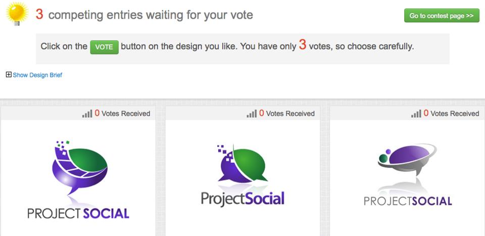
At the end of the 5th day, I'd received designs from more than 25 designers from around the world. I selected 3 finalists (not a difficult task), and provided specific instructions about revisions. Once I had revised designs in hand, I took a screenshot of them and posted it on my personal Facebook page to get feedback from my friends. This turned out to be an inspired idea.
The middle design… people said it looked like a cow's udder. Eliminate. I was told the 3rd design looked like a tornado. And the first design, many liked it but hated the capital letters in the name… didn't capital letters in social media equate to YELLING??? I also had asked the designers to add reflections of the speech bubble beneath the images, but my friends said they looked like shark fins.
A Finalist Emerges
In the end, I chose the design by Jones12. Many people think the graphic in the center of the speech bubble looks like a film strip. Actually, I thought of that graphic as my clients' message and branding, being pushed out towards the different social networks (the little squares). But since it did sort of resemble a filmstrip, I decided to change my job title to "Executive Social Media Producer," because I help my clients tell their story.
 Interestingly, after posting the 3 candidates on my Facebook wall, one of my friends (a graphic designer) sent a private message, sharing his discomfort with the whole concept of crowdsourcing for a logo. He said, "is that how you propose your social media services be sold? By people winning a contest?" Well, no… but what I provide is a monthly service in which we create and post different content each month, whereas graphic design for a logo is a one-time thing. I understand some may see this as a cheapening of the graphic design industry. But to me, I saw this as a way to get access to many designers that I might not otherwise have found, and for a very reasonable price. And to be honest, it was fun!
So that's the way, it became the new Project Social logo!


1 Responses