There’s an old saying, that two things in life which remain constant are death and taxes. Perhaps they should add “Facebook changes” to this list. Back in December, Facebook changed the format for the personal pages of their users. Many people liked this format, and (what a shocker!) others complained. But there was no going back… these changes were here to stay.
Those of us who serve as admins for business pages wondered, “Are they also planning to change the format for business pages?” The answer was a resounding “Yes”, and yesterday, Facebook rolled out the announcement of all their changes. They won’t go into effect for all pages until March 11, 2011 (although you can go ahead and upgrade now if you’d like). So while we have a month to consider all of this, what does this mean for you?
Format
There are a number of changes to the layout of the new Facebook business or fan page (let’s call them fanpages, for simplicity). Here are the major ones:
1. Photo Strip – You know that cool photo strip that resides at the top of your personal page? There are now blocks for 5 photos sitting at the top of your fanpage, beneath your company name. This has the potential to be a very important piece of real estate on your Facebook page. People had a great time with this photo strip on their personal pages. For example:
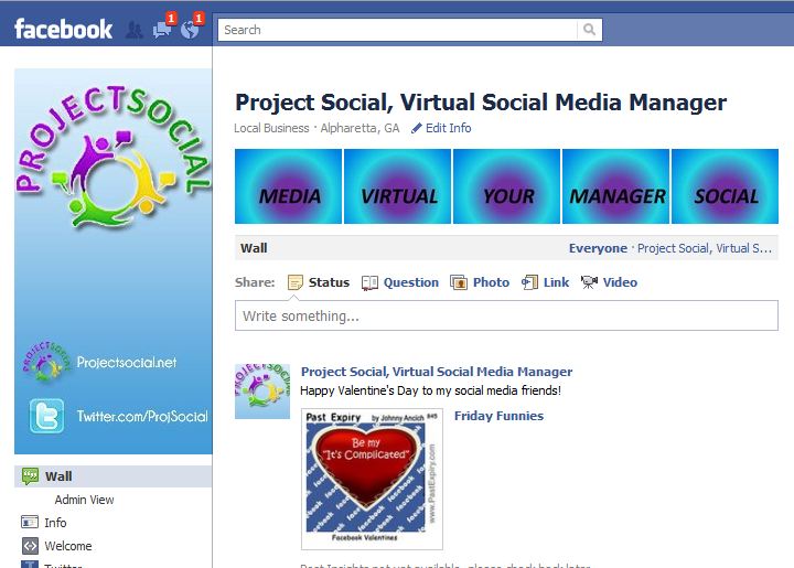
Cool, right? So why do I say this has the “potential” to be an important piece of real estate? Because on the fanpages, the photos at the top are placed randomly. It won’t post any photos uploaded by fans, and you can delete photos from the strip (although they won’t be deleted from your album). Still, this is what it looks like on my page:
No, I don’t think my tag line is “Media Virtual Your Social Manager.” Hopefully, Facebook will work out this issue so we can take advantage of this great tool.
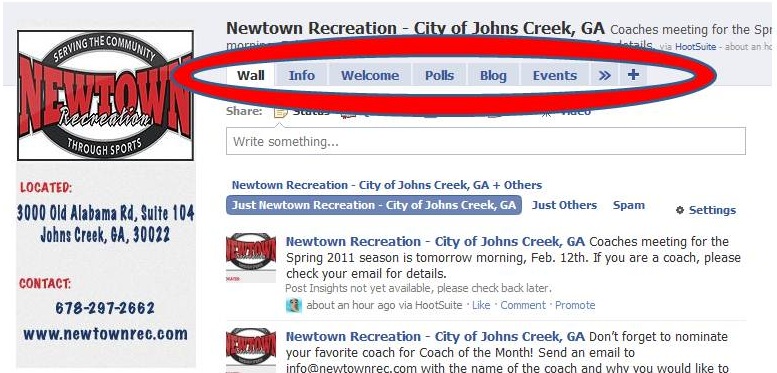
2. Tabs – Facebook offers businesses the opportunity to customize their pages using tabs. Before the changes, this is what the tabs looked like, at the top of the screen:
Now, Facebook has moved these tabs over to the left side of the screen, like so:
Because Facebook is only showing the first 5 tabs (after the Wall), you’ll need to re-order put your tabs so the most important ones show up automatically. (By the way, can we still call them “Tabs” or should we be calling them “Apps”? Hmmmm….)
3. Company “Likes” – It used to be that under your info box (beneath your profile picture) you could see who your fans were, and also a small listing of the Facebook company pages that you liked as well. Now, the list of people who like your fanpage have moved up to the top right, and in this space, you only see a total. Also, the list of your Favorite Pages has gained greater importance. In addition, a page can choose to feature the page admin (or “owner” )! Here’s what it looks like for Project Social:
The one thing I don’t like about this feature is that for some reason the Page Owner is leaving off my last name. The fact is that Karen Schneiderman is my sister-in-law’s name, so I’d rather it say “Karen Schneiderman Naide.” Nonetheless, this is a great way for admins to get exposure on their clients’ pages… and to provide a bit more transparency to the process.
4. Good-bye, FBML, hello iFrames. In a way, this is a change that only we Facebook geeks would understand on first glance. I’m sure you’ve heard of HTML, right? That’s the language used by Internet designers to code what’s on your page. Well, Facebook had their own language, called FBML which was very similar to HTML but was only used on Facebook. This could be used specifically for designing landing tabs and additional custom pages (for example, on Scott Isaacs’ page up above, the “Welcome” page and the “Books” page were created using FBML).
Well, a lot of people didn’t like FBML, so it’s now going the way of the dodo, and Facebook will now only accept pages designed with a different format called iFrames (although if you have a page created with FBML before March 11, it can stay). While this may not affect those of us who aren’t on the development side of Facebook, it IS important because you’ll want to work with a designer who understands iFrames and the designing process when creating your landing page.
5. Size Does Matter. Initially, the size of the space where your landing page lives was reduced a bit, and some of the cool graphics on the landing pages of myself and my clients were being cut off. However, Facebook admitted this was a bug and they were “working on it”. It looks like some geeks out in Menlo Park, CA were up coding all night because this morning, the graphics look just fine.
One last formatting item: the profile picture HAS been reduced. If you’ve only been using a small logo in the spot for the profile page, you’re wasting valuable real estate. The profile picture size for Pages has now been adjusted from 200 x 600 to 180 x 540. If you don’t know how to make this change, you’ll want to work with somebody who does!
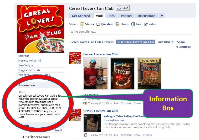
6. Where’s the Info Box? Pre-changes, directly beneath your profile picture was an Information Box. This was where you post a quick blurb about your page and your company, and people could see what your page was about right away. Here’s how it looked beforehand:
This Info Box is now gone. Facebook has moved it to the Info tab (or app). To ensure that potential customers know what your page is about immediately, you’ll want to work with somebody who can help you make the best use of the available space on your fanpage.
Communication
One of the great new features is the ability for admins of pages to toggle between themselves and their clients.
1. Commenting – In the past, admins of Facebook pages could only post items on their client’s pages as the client, not as themselves (the individual). That’s all changing now. If you look at the image below, you’ll see that under my name it says, “Use Facebook as a Page.” Once you click on this, you can “become the page.”
In the past, if you wanted to respond to a fan’s comment on the wall, you could only do it as the fanpage. But what if I, Karen Naide, really want to comment on something on Scott Isaacs’ page, but just as myself? Well now I can do that, by toggling back and forth. In addition, your fanpage can now comment on the walls of other fanpages (but not a personal page). So let’s say I want to comment on a new eBook that Dr. Isaacs has posted on his page, and say “Well done”, but I want to do it as Project Social. This is now possible.
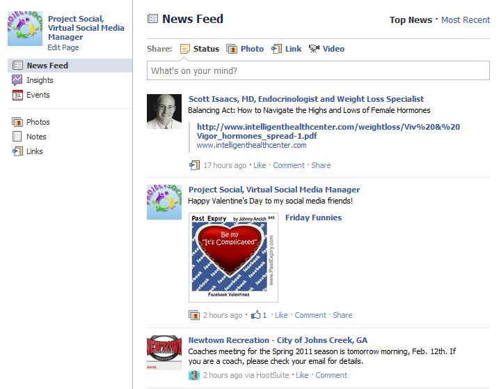
2. Newsfeed – By toggling back and forth, this also allows you to see the newsfeed as if you were the business. Here’s how: when I click on the word “Facebook” up on the left top corner, it shows me the newsfeed. With the new features, I can switch to “Project Social” mode so I can see what all of my Favorite pages (the ones you see under “Format #3” up above) are doing on Facebook, and here’s how it looks:
3. Notifications – As a busy company (or social media manager!), one challenge of maintaining a Facebook page is the ability to monitor what’s being said on your page. In fact, this is often the number one objection I hear from companies who aren’t sure they want to use Facebook: “What if somebody posts something negative and I don’t have time to check it out, remove it, or respond?”
Actually, monitoring the page is critical. You want to make sure to respond to comments left by your fans… after all, this is what makes social media social… you can interact with your customers! Also, you want to make sure that nobody is spamming your page by putting their own company’s advertisements on your page. Pre-changes, you could only find this out in one of two ways, by manually checking the fanpage on a regular basis or by using the wonderful system “Hyper Alerts” (which emails you when a comment is left on your page).
With the rollout of the new changes, you can now receive emails every time somebody posts on your page. It just takes a few adjustments to your fanpage to make that happen. A good social media manager can show you how to do that.
Conclusion
These are not all of the changes that were rolled out yesterday, but it certainly hits the highlights. If you have any questions about how to capitalize on the newest features, please don’t hesitate to contact me.
Related articles
- Facebook Pages Get A Massive Overhaul, Now Look More Like User Profiles (fastgush.com)
- Introducing iframe Tabs for Pages (developers.facebook.com)
- Facebook Page redesign: 10 things admins should do RIGHT NOW. (thesocialpath.com)


1 Responses